The Emirates NBA Cup 2025 tips off on Oct. 31 and will once again feature playing courts with a bold and distinctive style.
The Emirates NBA Cup is back, and so are the custom designed courts for each team.
For the past two seasons, the courts have been designed by artist Victor Solomon in collaboration with all 30 teams. Solomon, who also helped design the NBA award trophies and the NBA Cup trophy, has a long history of creating basketball art.
Solomon spoke with NBA.com about the process to design this season’s NBA Cup courts and how the league has created a system to continue refining these designs for future seasons.
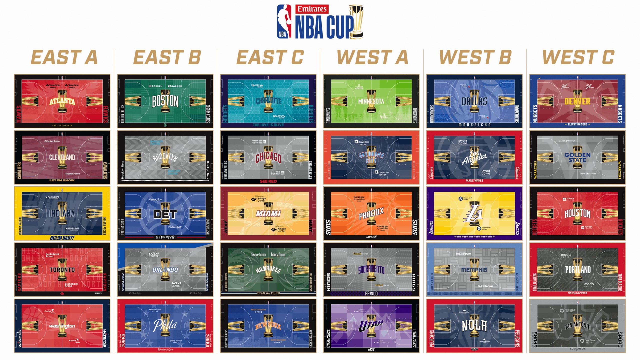
> All 30 court designs for Emirates NBA Cup 2025
> Complete coverage
Editor’s note: The following interview has been edited and condensed for clarity.
NBA.com: This is your second season designing this massive project. What has the design process been like and how did it evolve for this season’s courts?
Victor Solomon: After the first tournament in 2023, the NBA reached out to me to add a little design language to the courts for Year Two. The original idea was very smart – create a way to differentiate NBA Cup games from regular season games. My big contribution to the idea is twofold: I was really obsessed last year and this year with the idea of transition. So each of the approaches are very elemental graphically, but they hinge on taking the team’s core color and sort of grading it across a few different phases.
The narrative entry point from last year was the three layers of concentric circles that represented the three phases of the tournament. This year, we continue to play with this gradient concept with a 5×5 mosaic that is a nod to the five players on each team and the five teams in each Group, and using that as the framework to build the graphical foundation of each court.
I think it’s important to know that the court as a canvas is very intimidating because of its scale. There could be an instinct to over-ornamentalize the core design with a million nooks and crannies into the form. So my second big contribution was to create something that was elementally graphic in its simplicity to set the table for a deeper collaboration with all 30 teams and allow them to contribute to each of their local stories.
The way we did that was to create an elemental base level for each team. We worked with them to identify a story or aesthetic or reference point that was unique to their market and something their fans could galvanize around (like the parquet floor in Boston or roses in Portland). Then that base idea was applied on top of the foundational color gradient on each court. That became the infrastructure of the creative approach, which we continued with this season’s designs and the 5×5 mosaic.
So for you and the teams, this was more a continuation of last year’s designs and not a complete restart?
Definitely, definitely. We also didn’t put any pressure on the teams to feel like they needed to reinvent the wheel every year. There are some teams that kept the same overlay layer that they did last year. As this tradition grows, the idea is that these different components will be levers that creatives can pull every season to evolve the designs.
This is such a big design process. Do you consciously tackle it differently than other pieces of art? Or is it fundamentally the same?
It’s a weird, third thing. It’s such a unique design challenge because you’re considering so many different things that are unlike what my work traditionally is. You’re trying to make a creative contribution to the discourse around basketball courts that have existed and see how we can push forward to do something that’s interesting and new. But then there’s a level of practicality that needs to be considered, whether it’s for the players or broadcasters or fans in the arena.
I also relied on the team creative directors to help provide a deeper understanding of their local markets. I don’t have boots on the ground in New Orleans to know what Pelicans fans want.
So there was just a lot to balance. Trying to thread the needle was a big challenge but incredibly rewarding. I can’t tell you how wild it is to be looking at my little laptop screen, designing this thing, and then to stand on it to see it in full view. Or to look up at a TV and see it being played on. I’m grateful for the opportunity.
How did seeing the courts in person and on TV last season impact your thoughts for this year’s courts? Were there things you immediately noticed that you wanted to tweak?
The plight of any ambitious creative is that you’re kind of always critiquing and trying to improve on what you’ve done before. So if you ever feel satisfied, it’s probably a sign you’re running out of ideas. So I’m always challenging myself creatively and thinking about what we could do differently.
The big learning for me with these full-color courts, and particularly when they’re based on a very vibrant color, is how do we make sure we’re contributing to the viewing experience and not distracting from the game. We want it to be an additive experience, and not an overwhelming one.
It’s a really unique experience. You kind of have to see it and touch it and go through the full process to appreciate all that goes into it.
Had you designed any basketball courts before this project?
Yeah, I’ve done a few basketball courts. I have a nonprofit foundation that’s dedicated to restoring basketball courts. So we were very familiar with it. But this is obviously a new animal.
For a broadcaster, there are colors and designs you can’t put on the court because of how it would look on TV. Are there guardrails you try to push up against? Or did you learn in these first two seasons that you shouldn’t be anywhere close to the limits?
I think the NBA learned a lot of things after the first season. So when they came to me with the opportunity, they shared some of the guardrails to avoid going down those roads. It was about the intensity for the viewing experience and the players.
There are things that are very clear we can’t have. It can’t be white because it shows up too vibrantly on broadcast and it’s potentially distracting to the players. Conversely, it can’t be black because you will lose some of the details of the jerseys or the movement, and, frankly, it sucks up too much light on the broadcast camera. So those were the creative guardrails they shared from the start.
The other thing that was an interesting creative challenge to consider was the design cannot be too drastically different from left to right as the main broadcast camera pans across the court throughout the game. As it pans back and forth, if it needed to change its exposure to accommodate for a darker side of the floor, then that would just be too complicated and create a mismatched viewing experience. So there are niche broadcast details that I could have never imagined.
We actually created these gigantic vinyl printouts of the designs and did a broadcast test in Phoenix before last season. They put a bunch of guys in jerseys and filmed each court design from all different angles to make sure that everything would register comfortably on camera. That was a big evolution between Year One and Year Two, and it’s become part of our process as we go through this creative exploration.
Do you have a favorite design from this year?
I’m always biased to my Boston Celtics. The parquet is so iconic. And last year, the circular designs may have been a difficult platform for teams to personalize. I think the structured grid this season lends itself to more creative contribution from the teams. So the parquet actually engages with the platform more seamlessly this year.
Was there a design that was particularly difficult this season? Or did the grid make things more universal?
I was really impressed with what every team did this year, so that was cool.